Wednesday, October 29, 2014
Walk Run Jump Cycle Animation
Yet another project done for 3D Animation. This time we had to download a rigged character from BlendSwap and then animate them. I chose a rig of Finn from Adventure Time.
Successes: The animations run pretty smoothly. Finn still looks pretty normal, even in the poses i put him in to animate him.
Recommendations (if I were to do the project again): Oh, dear god. So. Many. First, slow it down, that's a big one. Second, adjust the camera angles so the viewer can actually SEE what he's doing. Third, the rig was set up in Cycles Render, and not Blender Render. That was a disaster. It took like 10x longer to render out the frames and it was all grainy and the colors were off, as you an tell.
That's it. I'm done. Bye.
Tuesday, September 23, 2014
Animated hand
So...we did hand animations in 3D Animation class, aka my second year of Digital Media.
It turned out...okay. I know I'm being picky, considering this is my first armature animation, but the joints are a little messed up and I didn't really give myself the time to try and fix it. I suppose that could be a recommendation that I'm giving myself if I had to do this again: give yourself more time to fix the joints for when they bend and/or figure out how to fix them. As far as successes on this project go, I'm happy with how it did turn out for my first time animating armatures. I like how it looks when it's not bent or anything and I like the end, when it's making the rock and roll hand symbol.
I think this project reflects what I've learned so far, considering we're only a few weeks into the school year. So far we've only learned how to make armature rigs and now animate them, but only for a hand.
I know it's not perfect, but hey...I'm still only an armature...hehe...modelling humor...
Wednesday, June 4, 2014
Spaceship Critique Reflection
So, this is in reference of my post with my spaceship animation on it...in our class, we watched everyone's animations and gave the creators a critique on their work. So yeah...
1) Examine the comments you received on your animation.
Okay, I'm examining them...these are definitely comments...
2) Reflect on what you feel you did best.
I think I animated most of the scenes really well...There's one or two that I wish I had done better on. It was lit very well, and the camera movements and angles were really good.
3) Reflect on what your classmates said you did well.
I notice a few recurring comments:
4) Reflect on what you feel you need to improve on.
In my opinion, the scene where most of the ships explode could've been animated better, and the music was really repetitive. I thought it was too bright and my storyboard didn't really match some of the scenes I used.
5) Reflect on what your classmates suggested you improve on.
Others opinions were thus:
6) Finally, write a statement on your strengths and weaknesses and formulate a plan for what to focus on during future projects. What can you improve? What are your strengths and how can you make them even better?
I think most of it was well animated and the music was repetitive and odd, but a good choice. I could improve on my animating skills. I'm good with modeling, lighting, and transitions, but I think more practice is definitely a good option.
1) Examine the comments you received on your animation.
Okay, I'm examining them...these are definitely comments...
2) Reflect on what you feel you did best.
I think I animated most of the scenes really well...There's one or two that I wish I had done better on. It was lit very well, and the camera movements and angles were really good.
3) Reflect on what your classmates said you did well.
I notice a few recurring comments:
- good music
- good variety of angles
- animation flowed well
- the opening credits looked good
- good length
- etc.
4) Reflect on what you feel you need to improve on.
In my opinion, the scene where most of the ships explode could've been animated better, and the music was really repetitive. I thought it was too bright and my storyboard didn't really match some of the scenes I used.
5) Reflect on what your classmates suggested you improve on.
Others opinions were thus:
- it was a bit repetitive at times, like in the scene of Monica's ship exploding and in the music
- the lighting could've been a bit darker
- use less transitions/cuts
- line things up with the Rule of Thirds more
- the plot could've been better developed
6) Finally, write a statement on your strengths and weaknesses and formulate a plan for what to focus on during future projects. What can you improve? What are your strengths and how can you make them even better?
I think most of it was well animated and the music was repetitive and odd, but a good choice. I could improve on my animating skills. I'm good with modeling, lighting, and transitions, but I think more practice is definitely a good option.
Tuesday, June 3, 2014
Photoshop Blur Experiments
We took photos of our school and put blur layers on them in Photoshop. Results were pretty cool.


Wednesday, May 28, 2014
Adobe Illustrator
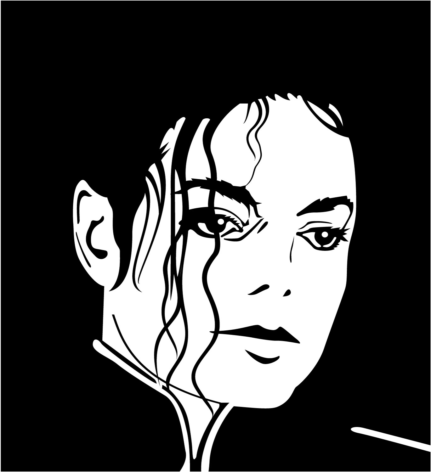
So...to those who follow this blog because they actually want to and not because they're my teacher checking to make sure I do my reflection assignments....we took pictures and traced over the lines in Adobe Illustrator to turn the pictures, rastor images, in to vector images. Then we created three different backgrounds for them: one with vector shapes from Illustrator, one with a gradient background (also in Illustrator), and one with "custom shapes" in Photoshop. Here they are in that order:


And now the response questions:
1) Reflect on your persistence throughout the project. Were you able to maintain focus and care while working through challenges?
Well, at first I had a challenge with painting the thing because I made all the lines into one big Live Paint group instead of the individual layers, but I soon remedied that. Really the only challenges were getting a plaid design on the shirt because it was a plaid shirt in the original picture and trying different brushes for the lines because the brushes made all the lines the same line weight, but yeah, I kept a cool head and worked through it as best as I could. I must say, I'm pretty happy with the result.
2) Reflect on composition design, line weight, brush choice, color harmonies, and background design.
I like how the composition came out...there's a focus point right behind my head....so yeah...As for line weight, I dealt with that as I made the lines. For brush stroke, after I experimented with different brushes, I discovered that it made all of my lines the same line weight. I didn't want to have to repeat all of my previous work, so I forwent a fancy brush and just kept the regular lines. Color harmonies, I tried to match the colors to the color of my clothes in the original picture. I used colors in the background and on the railing I'm holding in the picture that were supposed to be harmonious with the dark blue of my shirt. For background design, I used what I thought looked good, colors that were close to the color harmony with the dark blue, and things that represented me, such as the "heart" on my pocket in the last picture that's made out of a treble and bass clef because I love music.
3) Discuss successes and recommendations (if you were to complete the project again).
I like how the backgrounds and the plaid shirt came out. I'm proud of how the hair came out as well. The eyes could've been done better, along with the ears. I like the hands and how they line up with the railing.
Thursday, April 10, 2014
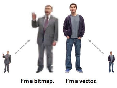
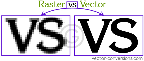
Raster vs. Vector Digital Imaging
Raster Images:
Raster images are created on bitmaps, using bits. Bits are the simplest element in the digital world, and they can be turned on or off, black or white, 1 or 0, etc. This is known as binary because there are two options. Bitmaps with a bit depth of 1 bit have only those two options (0 and 1). A bitmap wit ha bit depth of 2 has 4 different color options (00, 01, 10, 11). A bitmap with a bit depth of 4 has 16 different color options (0000, 0001, 0010, 0011, 0100, 0101, 0110, 0111, 1000, 1001, 1010, 1011, 1100, 1101, 1110, and 1111). Basically 2 to the power of the bit depth. Raster images are usually photos or anything on a screen. They're more realistic and have more colors than vector images, but they can't be enlarged smoothly. Each bit is set in a specific place and enlarging a bitmap does not add more bits to it. All you get is bigger bits. So enlarging a raster image makes it become more pixelated.

Vector Images:
Vector images are created by using paths to connect points on a Cartesian Plane. The paths used to connect the points are known as Bézier curves. Vector images are used in computer-aided design (CAD) programs and in 3-D animation. Vector images are not as realistic-looking, and there aren't as many possible colors, but they can be enlarged very smoothly. You can't take a picture with vector imaging. You can, however, turn a photograph into a vectored image.
Vector vs. Raster:
Monday, April 7, 2014
Spaceship
So in Digital Media, we were assigned to create a 3D model of a spaceship of our own design and then use various spaceships made by members of the class to create a short film. So...first off, here is the film:
Now I need to answer some response questions, so please excuse the mandatory derpiness I was assigned to write.
Reflect on your persistence throughout the project. Were you able to maintain focus and care while working through challenges? I feel that I was able to maintain most of my focus throughout the project. There were times when I took a break to rest my mind for a bit, but eventually, I was able to buckle down and finish it, and I love it.
Reflect on plot design, storyboarding, laser and explosion animations, sound and credits. I think my film matches up relatively well to the storyboard and plot I had designed. I think the explosion and laser animations could've gone a bit a faster in their respective scenes. I like the soundtrack that I created, even though I had initially planned to use an actual song (Livin' in the Sunlight by Tiny Tim) for the soundtrack, because I worked hard to make the right measures line up. I think the credits look pretty good, as well.
Discuss success and recommendations (if you were to complete the project again). If I were to do this project again, I would probably compress my storyboard a bit, get rid of a few more scenes than I already had. I would certainly make animating a bit easier. I would also try harder to stay focused. And if I could, I would go with my initial choice for the soundtrack instead of the loop tracks that Apple includes in Garageband.
So...yeah...that's my movie. Hope you liked it. Bye
-Rachael <3
Wednesday, January 15, 2014
Spaceships


My persistence throughout the project: I feel I was able to stay focused on my project and work through my problems and challenges carefully, but I didn't run into too many problems.
Reflections:
- Modeling - I feel I modeled my ship pretty accurate to my drawings.
- Texturing - I separated my ship into three different materials and textures: the actual ship, the window to the cockpit, and the engines/turbines. I used the "Magic" texture on my ship, which I think gave it a cool look, like it has a cloaking device or something.
- World Settings - I didn't make space dust, planets, meteors, etc. I think if I had, it would've taken away from the ship. Also, I made the actual space a dark blue color instead of black because if I had made it black, the ship probably wouldn't have been visible, given that I made it a dark gray color.
- Lighting - I used mostly spotlights to light the scene, which worked pretty well for me, but there was one spot near the back of the ship that I just couldn't seem to light. I probably could've lit it with a point light.
- Camera Placement - I feel making 7 pictures instead of the required 5 gives a better variety of camera placement. I tried to follow Blender's "Golden Rule" camera setting as closely as I could.
Subscribe to:
Comments (Atom)