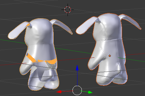
So...my last post was about "simple characters" and there were ideas for character models I could do in class. Well this is the model I decided on, a model of the little bunny toy (named Cuppy) from The Parent Trap movies.
The one with the more red-ish outline is the original model, the one with the orange outline is a retopology of that one. Something in the retopology got messed up, so some parts of the model didn't show when it was facing a certain way but would show facing the other way. That's why it looks so weird....
We ended up scrapping this assignment when it became clear to our teacher that teaching us how to add a skeleton rig so we could animate these suckers was gonna take a long, long time.
Friday, March 27, 2015
Friday, January 16, 2015
Simple Characters
As we are about to start on making models of our very own characters, we were told to find inspiration in the form of very simple characters that we admire. By simple, our teacher meant "biped, no fingers" simple.
Now, I am practically kicking myself for not thinking about this beautiful masterpiece of a webcomic until just before I started writing this post, but ladies and gentlemen, may I present, Homestuck by Andrew Hussie.
I could sit here and explain the entirety of Homestuck and its story, art, etc, but I'd rather not. Basically, while the characters do, in fact, have arms, these appendages are simply not visible in the characters basic designs, unless they happen to be using them.
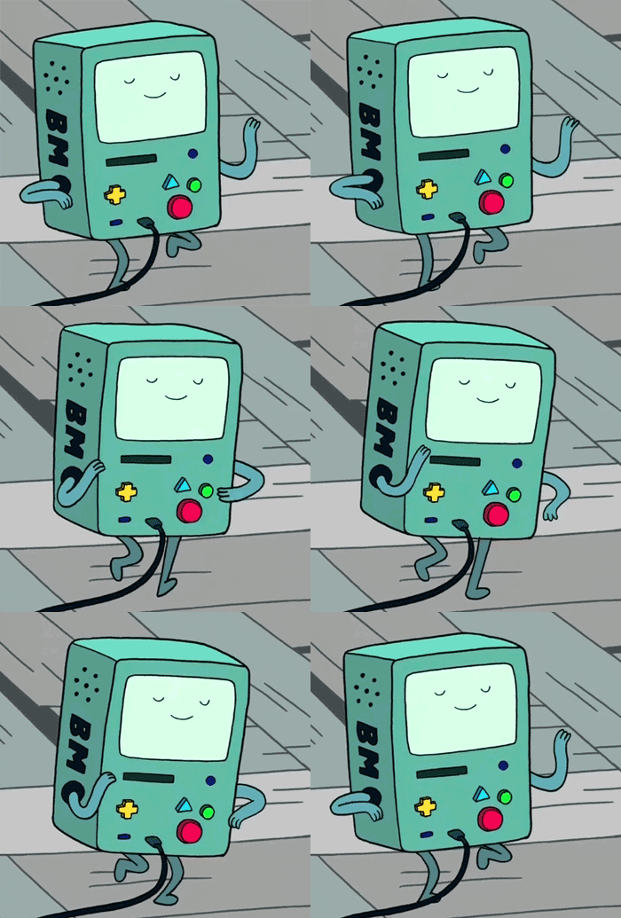
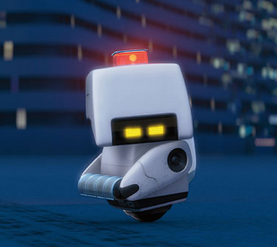
Other examples come in the form of adorable robots:


These guys are, in order, MO from Wall-E, Danbo from Yostuba&!, and BMO from Adventure Time.

Or there's the two-legged giraffe from a popular tumblr post:
Then, we were also told to come up with ideas for some simple characters of our own.
1) A little robot like one of those guys, maybe with, like, a little wind-up mechanism on the side
2) A marionette puppet, but, like, without the strings, kinda like Pinocchio. Maybe give him some little mitten hands, so not necessarily fingers, but still hands.
3) A little rabbit plush toy or beanie baby thing, like Cuppy from the Parent Trap.
4) A little teddy bear thing, just...teddy bear
5) Maybe...like...a Jack-in-the-Box that picks up his box to sprout legs or something to run...yeah
Now, I am practically kicking myself for not thinking about this beautiful masterpiece of a webcomic until just before I started writing this post, but ladies and gentlemen, may I present, Homestuck by Andrew Hussie.
Other examples come in the form of adorable robots:
These guys are, in order, MO from Wall-E, Danbo from Yostuba&!, and BMO from Adventure Time.
Or there's the two-legged giraffe from a popular tumblr post:
Then, we were also told to come up with ideas for some simple characters of our own.
1) A little robot like one of those guys, maybe with, like, a little wind-up mechanism on the side
2) A marionette puppet, but, like, without the strings, kinda like Pinocchio. Maybe give him some little mitten hands, so not necessarily fingers, but still hands.
3) A little rabbit plush toy or beanie baby thing, like Cuppy from the Parent Trap.
4) A little teddy bear thing, just...teddy bear
5) Maybe...like...a Jack-in-the-Box that picks up his box to sprout legs or something to run...yeah
Wednesday, October 29, 2014
Walk Run Jump Cycle Animation
Yet another project done for 3D Animation. This time we had to download a rigged character from BlendSwap and then animate them. I chose a rig of Finn from Adventure Time.
Successes: The animations run pretty smoothly. Finn still looks pretty normal, even in the poses i put him in to animate him.
Recommendations (if I were to do the project again): Oh, dear god. So. Many. First, slow it down, that's a big one. Second, adjust the camera angles so the viewer can actually SEE what he's doing. Third, the rig was set up in Cycles Render, and not Blender Render. That was a disaster. It took like 10x longer to render out the frames and it was all grainy and the colors were off, as you an tell.
That's it. I'm done. Bye.
Tuesday, September 23, 2014
Animated hand
So...we did hand animations in 3D Animation class, aka my second year of Digital Media.
It turned out...okay. I know I'm being picky, considering this is my first armature animation, but the joints are a little messed up and I didn't really give myself the time to try and fix it. I suppose that could be a recommendation that I'm giving myself if I had to do this again: give yourself more time to fix the joints for when they bend and/or figure out how to fix them. As far as successes on this project go, I'm happy with how it did turn out for my first time animating armatures. I like how it looks when it's not bent or anything and I like the end, when it's making the rock and roll hand symbol.
I think this project reflects what I've learned so far, considering we're only a few weeks into the school year. So far we've only learned how to make armature rigs and now animate them, but only for a hand.
I know it's not perfect, but hey...I'm still only an armature...hehe...modelling humor...
Wednesday, June 4, 2014
Spaceship Critique Reflection
So, this is in reference of my post with my spaceship animation on it...in our class, we watched everyone's animations and gave the creators a critique on their work. So yeah...
1) Examine the comments you received on your animation.
Okay, I'm examining them...these are definitely comments...
2) Reflect on what you feel you did best.
I think I animated most of the scenes really well...There's one or two that I wish I had done better on. It was lit very well, and the camera movements and angles were really good.
3) Reflect on what your classmates said you did well.
I notice a few recurring comments:
4) Reflect on what you feel you need to improve on.
In my opinion, the scene where most of the ships explode could've been animated better, and the music was really repetitive. I thought it was too bright and my storyboard didn't really match some of the scenes I used.
5) Reflect on what your classmates suggested you improve on.
Others opinions were thus:
6) Finally, write a statement on your strengths and weaknesses and formulate a plan for what to focus on during future projects. What can you improve? What are your strengths and how can you make them even better?
I think most of it was well animated and the music was repetitive and odd, but a good choice. I could improve on my animating skills. I'm good with modeling, lighting, and transitions, but I think more practice is definitely a good option.
1) Examine the comments you received on your animation.
Okay, I'm examining them...these are definitely comments...
2) Reflect on what you feel you did best.
I think I animated most of the scenes really well...There's one or two that I wish I had done better on. It was lit very well, and the camera movements and angles were really good.
3) Reflect on what your classmates said you did well.
I notice a few recurring comments:
- good music
- good variety of angles
- animation flowed well
- the opening credits looked good
- good length
- etc.
4) Reflect on what you feel you need to improve on.
In my opinion, the scene where most of the ships explode could've been animated better, and the music was really repetitive. I thought it was too bright and my storyboard didn't really match some of the scenes I used.
5) Reflect on what your classmates suggested you improve on.
Others opinions were thus:
- it was a bit repetitive at times, like in the scene of Monica's ship exploding and in the music
- the lighting could've been a bit darker
- use less transitions/cuts
- line things up with the Rule of Thirds more
- the plot could've been better developed
6) Finally, write a statement on your strengths and weaknesses and formulate a plan for what to focus on during future projects. What can you improve? What are your strengths and how can you make them even better?
I think most of it was well animated and the music was repetitive and odd, but a good choice. I could improve on my animating skills. I'm good with modeling, lighting, and transitions, but I think more practice is definitely a good option.
Tuesday, June 3, 2014
Wednesday, May 28, 2014
Adobe Illustrator
So...to those who follow this blog because they actually want to and not because they're my teacher checking to make sure I do my reflection assignments....we took pictures and traced over the lines in Adobe Illustrator to turn the pictures, rastor images, in to vector images. Then we created three different backgrounds for them: one with vector shapes from Illustrator, one with a gradient background (also in Illustrator), and one with "custom shapes" in Photoshop. Here they are in that order:
And now the response questions:
1) Reflect on your persistence throughout the project. Were you able to maintain focus and care while working through challenges?
Well, at first I had a challenge with painting the thing because I made all the lines into one big Live Paint group instead of the individual layers, but I soon remedied that. Really the only challenges were getting a plaid design on the shirt because it was a plaid shirt in the original picture and trying different brushes for the lines because the brushes made all the lines the same line weight, but yeah, I kept a cool head and worked through it as best as I could. I must say, I'm pretty happy with the result.
2) Reflect on composition design, line weight, brush choice, color harmonies, and background design.
I like how the composition came out...there's a focus point right behind my head....so yeah...As for line weight, I dealt with that as I made the lines. For brush stroke, after I experimented with different brushes, I discovered that it made all of my lines the same line weight. I didn't want to have to repeat all of my previous work, so I forwent a fancy brush and just kept the regular lines. Color harmonies, I tried to match the colors to the color of my clothes in the original picture. I used colors in the background and on the railing I'm holding in the picture that were supposed to be harmonious with the dark blue of my shirt. For background design, I used what I thought looked good, colors that were close to the color harmony with the dark blue, and things that represented me, such as the "heart" on my pocket in the last picture that's made out of a treble and bass clef because I love music.
3) Discuss successes and recommendations (if you were to complete the project again).
I like how the backgrounds and the plaid shirt came out. I'm proud of how the hair came out as well. The eyes could've been done better, along with the ears. I like the hands and how they line up with the railing.
And now the response questions:
1) Reflect on your persistence throughout the project. Were you able to maintain focus and care while working through challenges?
Well, at first I had a challenge with painting the thing because I made all the lines into one big Live Paint group instead of the individual layers, but I soon remedied that. Really the only challenges were getting a plaid design on the shirt because it was a plaid shirt in the original picture and trying different brushes for the lines because the brushes made all the lines the same line weight, but yeah, I kept a cool head and worked through it as best as I could. I must say, I'm pretty happy with the result.
2) Reflect on composition design, line weight, brush choice, color harmonies, and background design.
I like how the composition came out...there's a focus point right behind my head....so yeah...As for line weight, I dealt with that as I made the lines. For brush stroke, after I experimented with different brushes, I discovered that it made all of my lines the same line weight. I didn't want to have to repeat all of my previous work, so I forwent a fancy brush and just kept the regular lines. Color harmonies, I tried to match the colors to the color of my clothes in the original picture. I used colors in the background and on the railing I'm holding in the picture that were supposed to be harmonious with the dark blue of my shirt. For background design, I used what I thought looked good, colors that were close to the color harmony with the dark blue, and things that represented me, such as the "heart" on my pocket in the last picture that's made out of a treble and bass clef because I love music.
3) Discuss successes and recommendations (if you were to complete the project again).
I like how the backgrounds and the plaid shirt came out. I'm proud of how the hair came out as well. The eyes could've been done better, along with the ears. I like the hands and how they line up with the railing.
Subscribe to:
Posts (Atom)